The awkward part was not the chart
The Environment Agency publishes separate annual extracts for waste received by permitted facilities and waste removed from them. The files are large binary workbooks, inconsistent between years and contain confidentiality-driven blanks.
The larger analytical risk is conceptual. Received and removed records describe two views of the same national system. Merging or summing them without a clear definition can count the same physical waste once on entry and again on exit.
Objective: answer what happens to waste, what categories move through each region and how volumes changed from 2023 to 2024, while keeping operational handling separate from physical net flow.
Cleaning upstream instead of asking Power BI to do everything
Loading multiple .xlsb files directly through Power Query was slow and fragile. The extraction stage moved into Python so the dashboard could consume two smaller, predictable master files.
The fallback sheet-matching step is intentionally practical. If a future release changes “2024 Waste Received” to a slightly different label, the script searches available tab names for the relevant phrase instead of failing on an exact string.
A star schema built around the definition of flow
FactReceivedWaste and FactRemovedWaste are kept independent. Year, facility region and waste category dimensions filter both. Fate applies to the outbound side, where the treatment outcome is recorded.
Total operational handling
Received plus removed. Useful for estimating facility workload, not unique physical waste.
Net waste flow
Received minus removed. The more appropriate measure of accumulation or depletion.
Shared dimensions
Region, year and category can filter both fact tables consistently.
Disconnected flow selector
A helper table drives Both, Received and Removed views through DAX SWITCH logic.
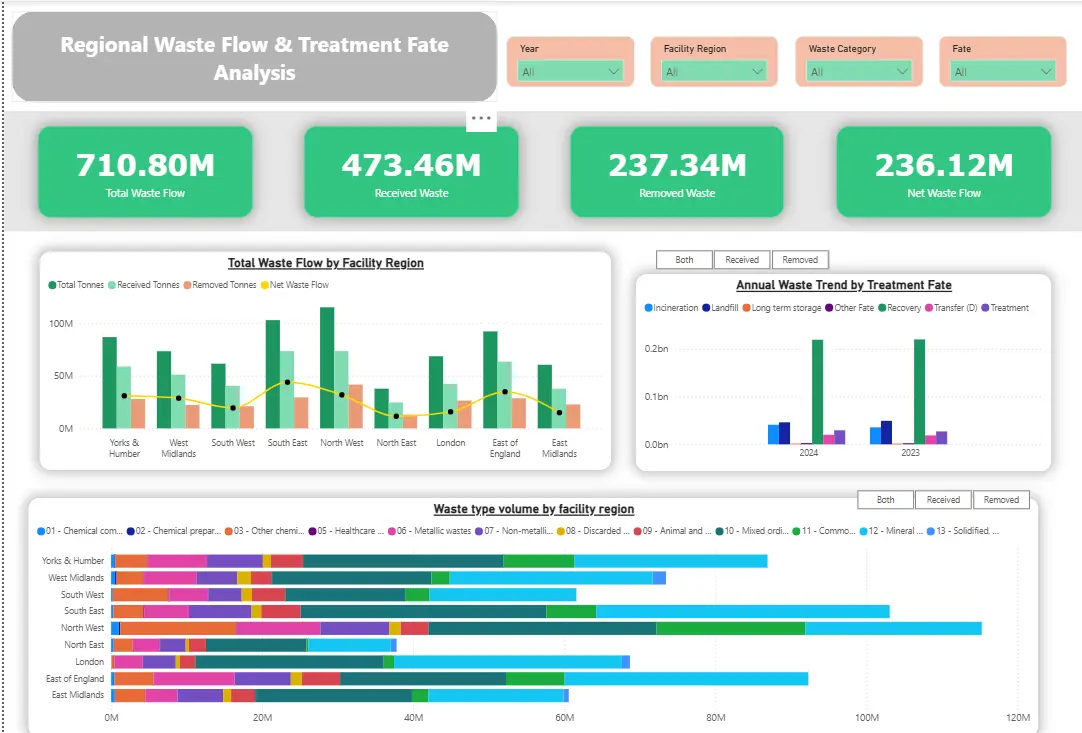
This model allows the dashboard to show 710.80 million tonnes of operational handling across the two years while keeping the separately defined net flow of 236.12 million tonnes visible. The two figures answer different questions and are labelled accordingly.
What the model surfaced
- Mineral waste dominated national inbound volume, which matters for heavy freight and facility planning.
- Mixed ordinary waste dominated outbound volume, showing a different composition after movement through the permitted system.
- London recorded a recovery-heavy profile in 2024, while regional comparisons showed materially different treatment mixes.
- Parts of the North West analysis showed negative net flow, meaning removed tonnage exceeded received tonnage and warranted investigation rather than automatic interpretation.
The findings are useful because the model preserves the direction of movement. Without that distinction, a large number could reflect workload, accumulation, backlog clearance or some mixture of the three.
Messy data that was deliberately kept messy
Blank operator and site details are often the result of approved commercial confidentiality claims. The tonnage remains valid even when identifiers are withheld. Removing those rows would make the dataset appear cleaner while quietly reducing national totals.
Apparent duplicates were also retained because identical-weight transactions can be genuine separate movements. With no reliable transaction key proving duplication, deletion would introduce an assumption the source could not support.
The dashboard leaves “(Blank)” options visible and documents why. That is less cosmetically tidy, but analytically more honest.
The analysis covers two years, so it should not be treated as a long-term trend model. Regional anomalies also require operational context before they become conclusions.