Safety events make more sense in place
A table of collision warnings can show frequency, but location gives the events operational context. Repeated warnings around the same roads or junctions may point towards a pattern worth investigating.
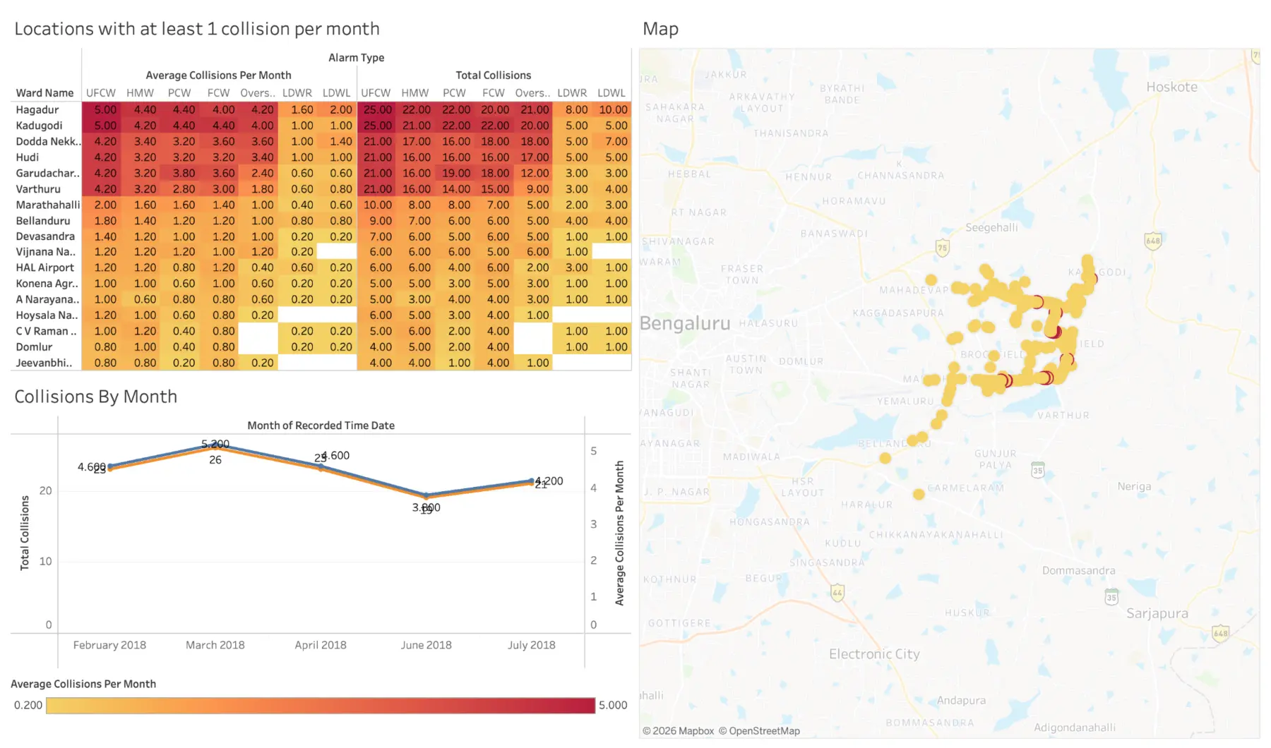
This project uses BMTC bus collision-avoidance data to explore the geographic distribution of events, identify hotspots and consider how effectively warnings support safer operation.
The dashboard is an investigation tool. A hotspot tells an analyst where to look more closely; it does not establish the cause of every warning at that location.
From event records to a navigable map
Designed for questions, not a static map
The Tableau view allows the user to explore where collision-warning events cluster and compare patterns rather than relying on one city-wide total.
Collision hotspots
Concentrated areas surface first so scarce investigation time has a starting point.
Pattern context
Interactive detail helps separate an isolated event from repeated warnings.
System evaluation
Warning events can be reviewed as evidence of where the technology is activated.
Safety action
The analysis supports targeted route, driver or road-environment review.
A signal for prioritisation
Used responsibly, the dashboard can help a transport analyst prioritise locations for deeper review and ask better questions about routes, junctions, operating conditions or warning-system behaviour.
The analysis is most useful when combined with exposure measures such as journeys or kilometres travelled, plus road geometry, time, weather and verified incident outcomes.
A warning is not automatically an accident
Collision-avoidance events show that the system detected a risky condition; they do not by themselves prove a crash occurred or that one party caused it. More warnings may also reflect more bus activity rather than a more dangerous road.
The dashboard should therefore guide investigation and safety planning, not be used as a standalone causal model.